Bringing startups and investors together, without making the people behind it harder to manage.
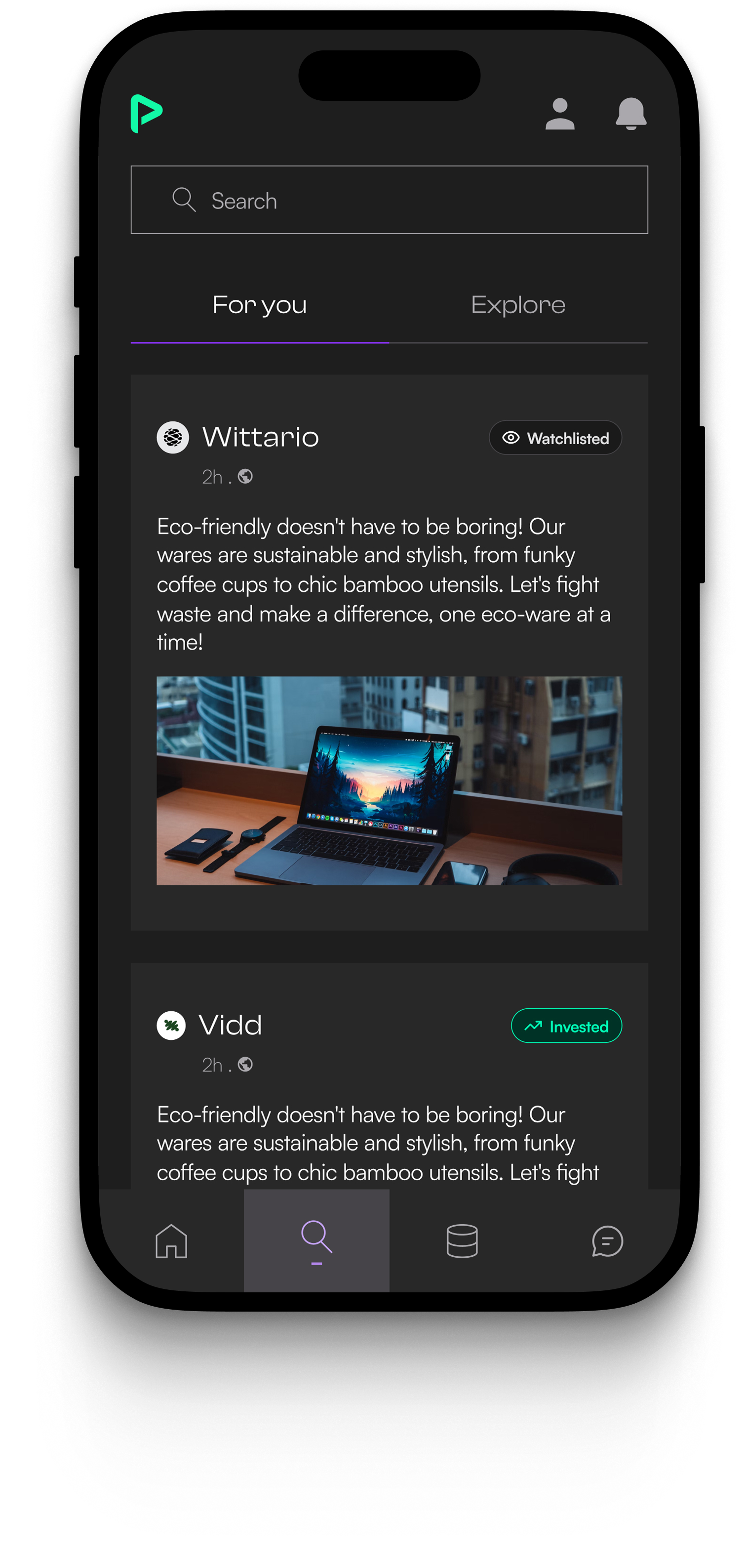
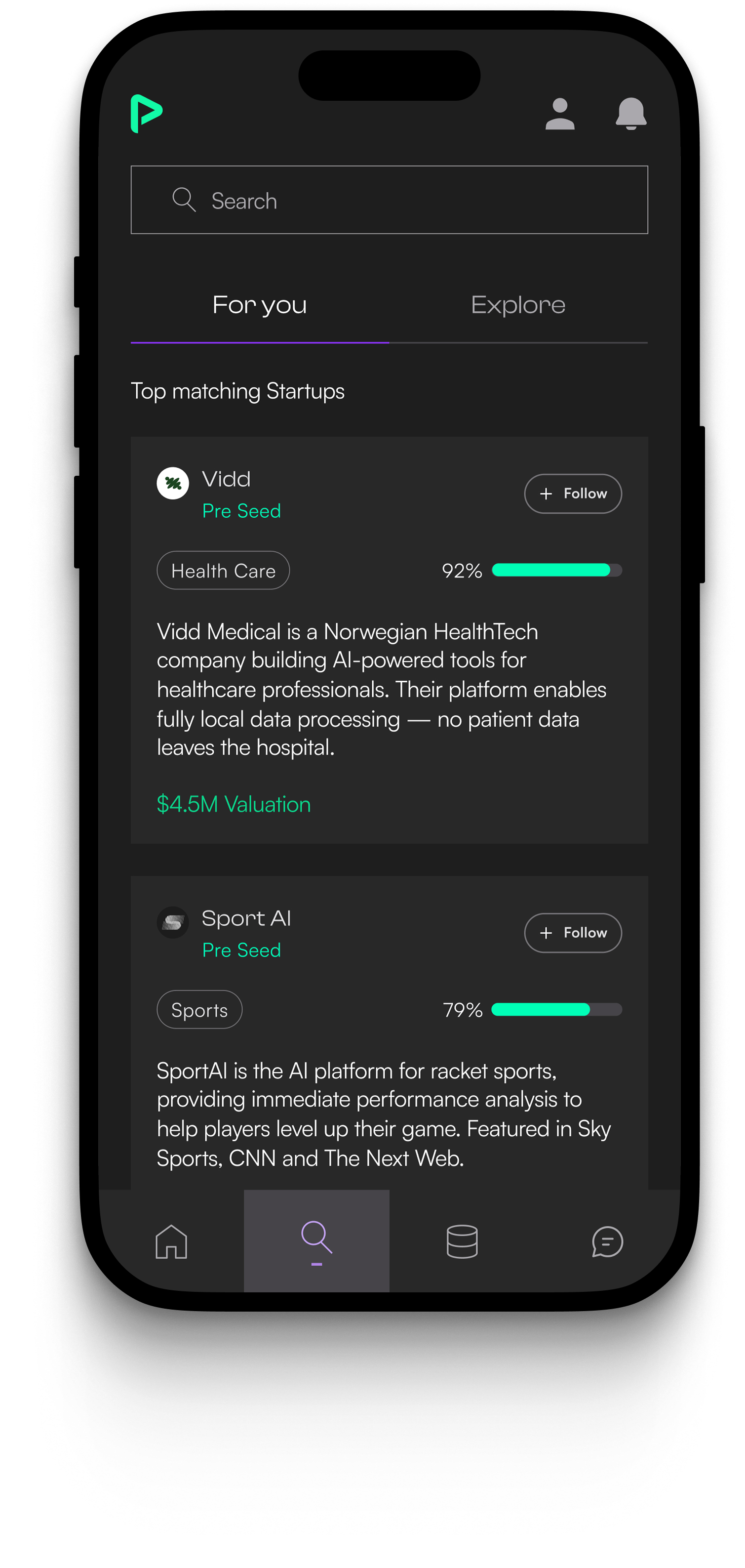
Pitch40 connects startups raising capital with investors looking for opportunities. Startups create profiles, upload their pitch, complete verification, and try to get discovered. Investors browse startups, shortlist the ones that fit, and move toward conversations or investment decisions. Behind that, an internal team reviews companies, verifies KYC, and keeps the marketplace moving.
Pitch40 connects startups raising capital with investors looking for opportunities. Startups create profiles, upload their pitch, complete verification, and try to get discovered. Investors browse startups, shortlist the ones that fit, and move toward conversations or investment decisions. Behind that, an internal team reviews companies, verifies KYC, and keeps the marketplace moving.
Investors reduced evaluation time from 7-15 minutes to under 5 minutes.
The platform recorded a 36% increase in investment decisions.
Matched deal volume grew from $4.7M to $8.9M.
Startup onboarding completion increased from 41% to 76%.
The CTO did not ask for a redesign. He asked where the product was leaking.
That question made the work different from the start. I was not handed one neat feature brief. I had to understand where people were slowing down, dropping off, repeating work, or waiting for the team to move something manually.
I was still early in my design career at that time, so even understanding the data felt like part of the project. What does average time actually mean here? Where is the drop-off happening? What can the dev team track? Which number matters, and which one is just noise?
The CTO helped me understand what data we could get. The developers helped me understand what was technically possible. Slowly, the problem became less abstract: Pitch40 was not missing more screens. It was missing clearer decision moments.
It was not one big broken screen. It was a chain of small leaks.
Once we looked across the journey, the work stopped feeling like separate features. Each problem was connected to the next one.
They were not here to scroll. They needed to understand which startups deserved their next few minutes.
They wanted to reach the marketplace, but onboarding asked for too much before they saw value.
They wanted to reach the marketplace, but onboarding asked for too much before they saw value.
Verification and review needed clearer status, queues, and bulk control to keep the marketplace moving.
The product did not need one dramatic redesign. It needed four connected fixes at the points where decisions slowed down.
Matching: from endless feed to faster investor decisions.
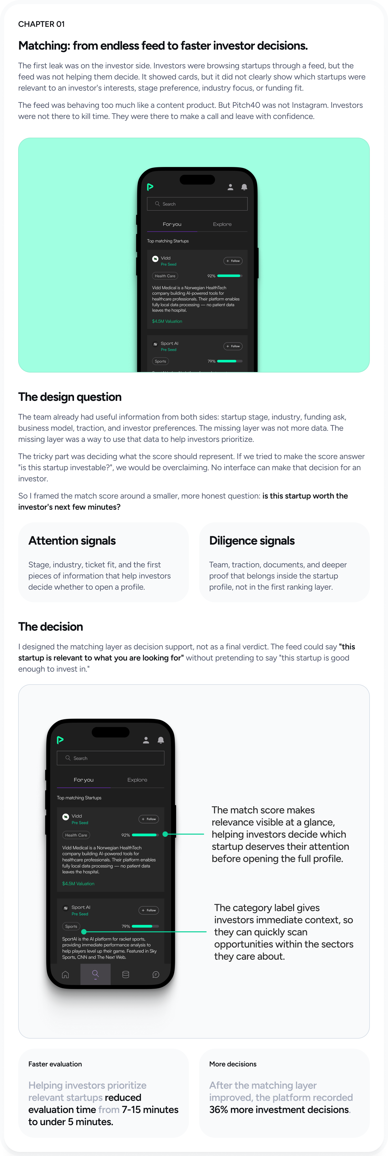
The first leak was on the investor side. Investors were browsing startups through a feed, but the feed was not helping them decide. It showed cards, but it did not clearly show which startups were relevant to an investor's interests, stage preference, industry focus, or funding fit.
The feed was behaving too much like a content product. But Pitch40 was not Instagram. Investors were not there to kill time. They were there to make a call and leave with confidence.
The design question
The team already had useful information from both sides: startup stage, industry, funding ask, business model, traction, and investor preferences. The missing layer was not more data. It was a way to use that data to help investors prioritize.
The tricky part was deciding what the score should represent. If we tried to make the score answer "is this startup investable?", we would be overclaiming. No interface can make that decision for an investor.
So I framed the match score around a smaller, more honest question: is this startup worth the investor's next few minutes?
Attention signals
Stage, industry, ticket fit, and the first pieces of information that help investors decide whether to open a profile.
Diligence signals
Team, traction, documents, and deeper proof that belongs inside the startup profile, not in the first ranking layer.
The decision
I designed the matching layer as decision support, not as a final verdict. The feed could say "this startup is relevant to what you are looking for" without pretending to say "this startup is good enough to invest in."
Faster evaluation
Helping investors prioritize relevant startups reduced evaluation time from 7-15 minutes to under 5 minutes.
More decisions
After the matching layer improved, the platform recorded 36% more investment decisions.
State indicators: giving the feed memory.
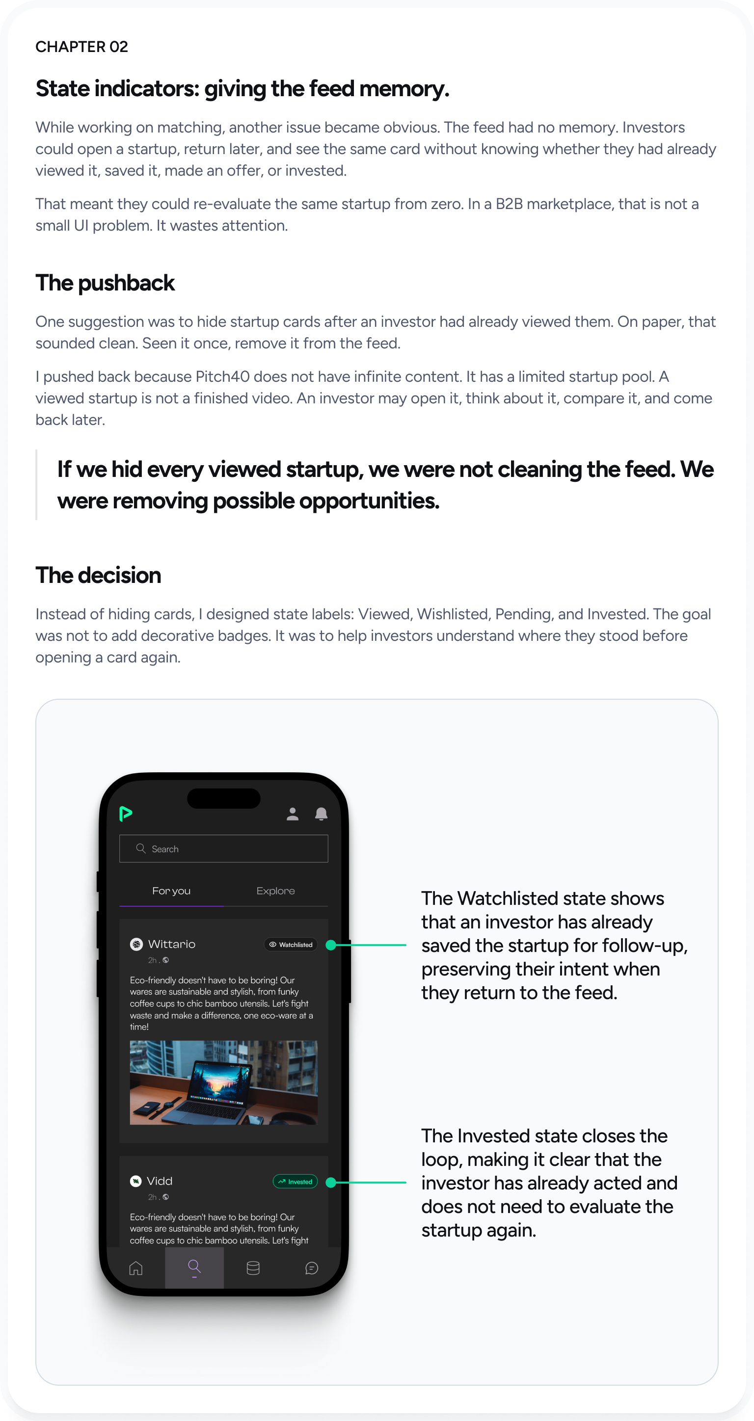
While working on matching, another issue became obvious. The feed had no memory. Investors could open a startup, return later, and see the same card without knowing whether they had already viewed it, saved it, made an offer, or invested.
That meant they could re-evaluate the same startup from zero. In a B2B marketplace, that is not a small UI problem. It wastes attention.
The pushback
One suggestion was to hide startup cards after an investor had already viewed them. On paper, that sounded clean. Seen it once, remove it from the feed.
I pushed back because Pitch40 does not have infinite content. It has a limited startup pool. A viewed startup is not a finished video. An investor may open it, think about it, compare it, and come back later.
If we hid every viewed startup, we were not cleaning the feed. We were removing possible opportunities.
The decision
Instead of hiding cards, I designed state labels: Viewed, Wishlisted, Pending, and Invested. The goal was not to add decorative badges. It was to help investors understand where they stood before opening a card again.

Onboarding: reducing friction before first match.
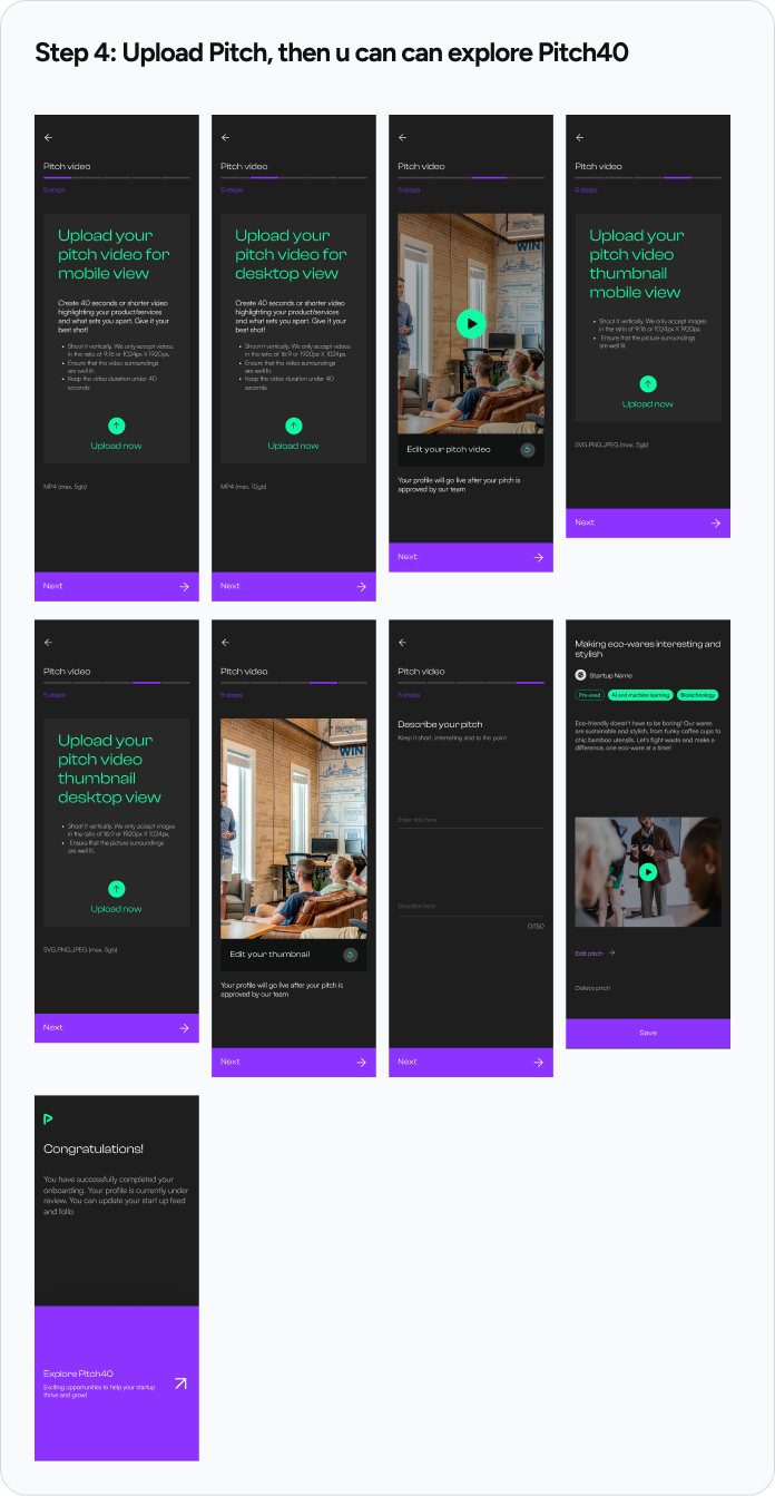
The next leak was on the founder side. Before a startup could get matched, it had to complete onboarding. But the flow was asking for too much too early.
Some information mattered, but not at the door. Founders were being asked to provide deeper details before they had even experienced the value of the platform.
The decision
I separated the information into two groups: what was needed to create a useful first match, and what could wait until profile completion. This kept the important data in the product, but moved heavy inputs out of the critical path.
The goal was not to make onboarding short for the sake of being short. The goal was to get founders to the first meaningful moment faster.
Time to value
Moving heavy profile work out of onboarding reduced time to first match from more than 2 days to under 20 minutes.
Completion
Once the first step became lighter, onboarding completion increased from 41% to 76%.
KYC and admin: making review faster behind the scenes.
The final leak was less visible to investors and founders, but it affected the whole marketplace. Pitch40 depends on trust. Companies need verification, but slow verification also slows the marketplace.
KYC and admin review needed clearer statuses, faster review actions, and better queue handling. When internal tools are unclear, the cost shows up as pending companies, support tickets, delayed founder progress, and slow decisions.
The decision
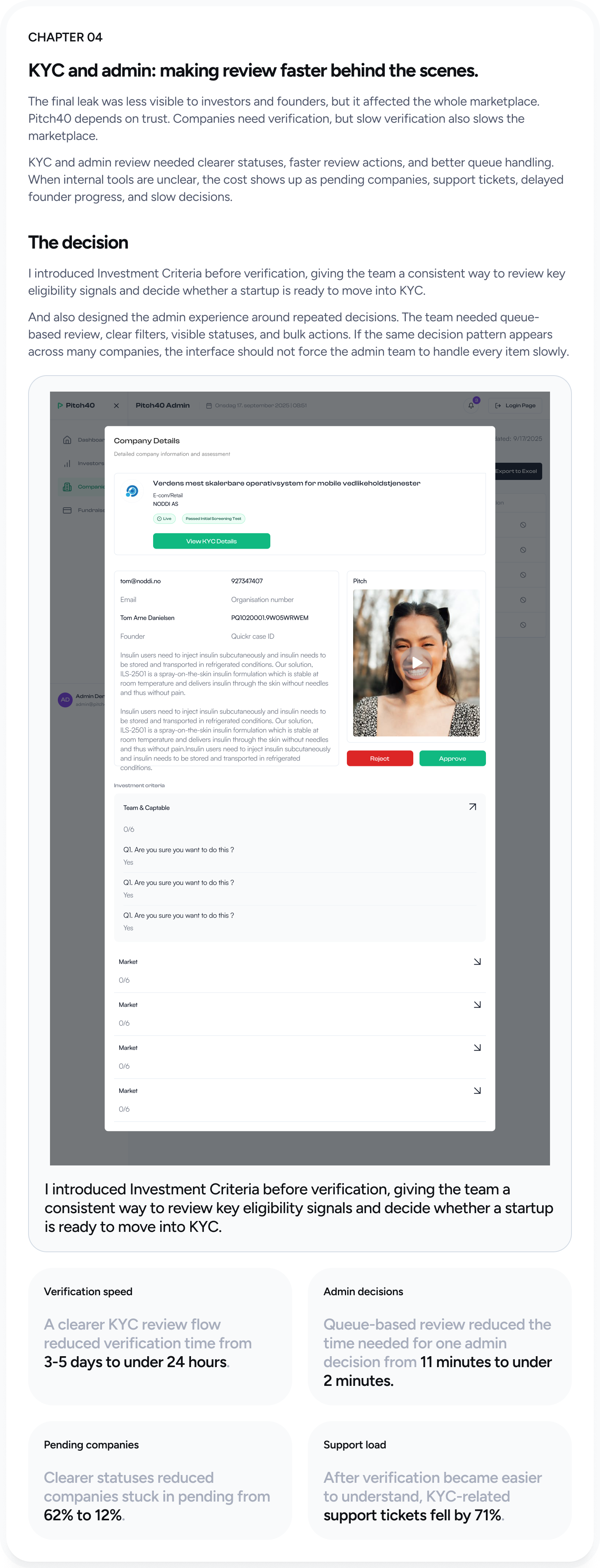
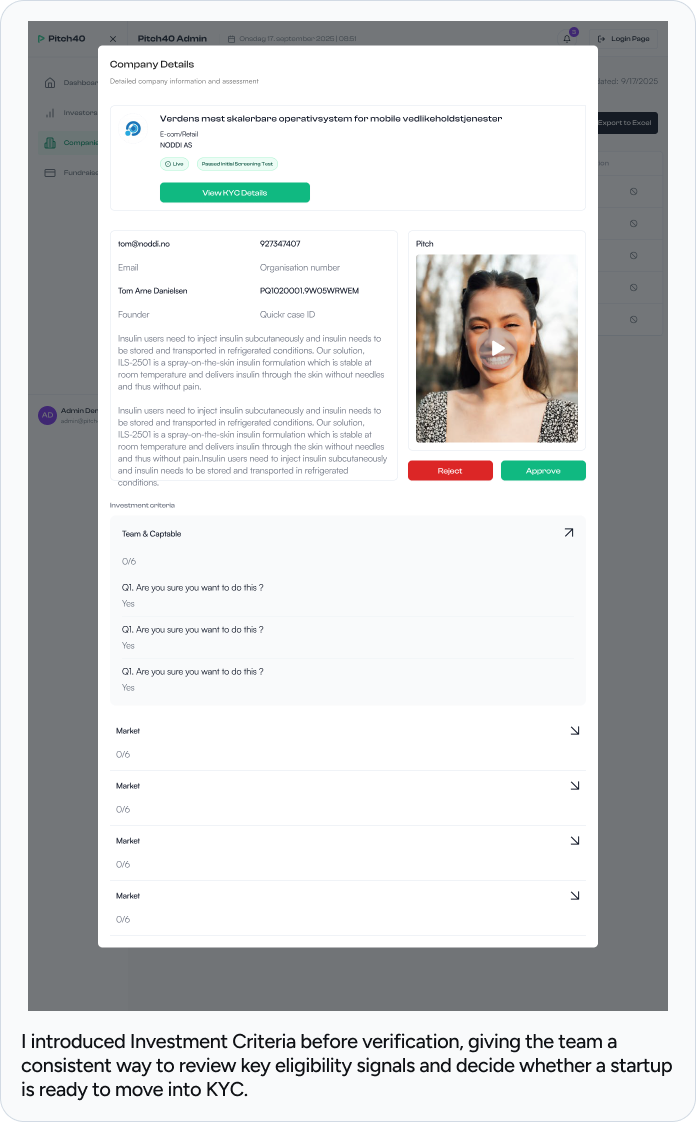
I introduced Investment Criteria before verification, giving the team a consistent way to review key eligibility signals and decide whether a startup is ready to move into KYC.
I also designed the admin experience around repeated decisions. The team needed queue-based review, clear filters, visible statuses, and bulk actions. If the same decision pattern appears across many companies, the interface should not force the admin team to handle every item slowly.
Verification speed
A clearer KYC review flow reduced verification time from 3-5 days to under 24 hours.
Admin decisions
Queue-based review reduced one admin decision from 11 minutes to under 2 minutes.
Pending companies
Clearer statuses reduced companies stuck in pending from 62% to 12%.
Support load
After verification became easier to understand, KYC-related support tickets fell by 71%.
Each fix solved a different leak, but the product goal was the same.
Investors slowed down when the feed lacked relevance. They repeated work when the feed had no memory. Founders dropped when onboarding asked too much too early. Internal teams slowed down when review and verification required too much manual effort.
Investors could evaluate a startup in under 5 minutes instead of spending 7-15 minutes.
Matched deal volume increased from $4.7M to $8.9M.
Founders reached their first match in under 20 minutes instead of waiting more than 2 days.
The admin team increased daily queue clearance from 14 to 52 reviews.
This project changed how I think about B2B design.
Before Pitch40, it was easy to think of design as screens, flows, and UI quality. Those things still matter. But in a B2B product, design also has to find where the business process is slowing down.
Sometimes the problem is not visible on one screen. Sometimes it is between screens. A founder gets blocked before reaching value. An investor opens the same startup twice. An admin spends ten minutes on a decision that should take two.
Good B2B design is not only about making the product easier to use. It is about helping the right people make the right decisions faster, with enough context to trust what they are doing.